EUI Split Button Component
A fast POC to explore primary action + menu patterns
Teams repeatedly recreate “primary action + caret menu” patterns. This POC tested whether EUI should offer a standard split button to reduce inconsistency and custom CSS.
Challenge
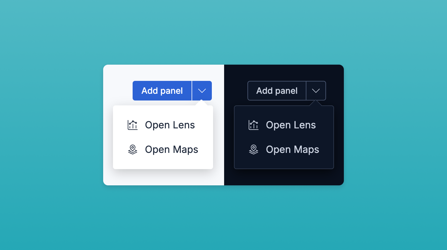
Product surfaces often need a single primary action plus a small set of related actions (e.g., Run, with options like Run with params, Schedule, Share). Teams hand-roll this pattern with different components (buttons + popovers), which creates inconsistency and technical debt.
Idea
Prototype a split button that:
- Exposes a clear primary action (left side)
- Provides a compact menu trigger (right side) for related actions
- Plays nicely with existing EUI theming, sizes, and iconography
- Keeps focus/keyboard behavior predictable and accessible
AI Workflow
- ChatGPT helped outline the component API (props, event surface, disabled/loading states) and accessibility considerations (focus ring, aria-expanded, menu roles).
- Cursor scaffolded the TSX component and story, wired up keyboard handling, and iterated prop types.
- I tested usage on real product flows to check sizing, density, and common action clusters.
Outcome
- A working split button POC with primary click + caret-triggered menu
- Scoped properties to keep buttons parts in sync stylistically through a single API
- Passed as reference PR to final engineering work; shortened planning with easier estimation
Reflection
This clarified demand for a shared pattern and helped frame the API discussion around real usage, not hypotheticals. AI tools sped up scaffolding so we could spend more time on behavior and accessibility.
Impact
Informed discussion on pattern guidance and potential component API for next planning cycle